
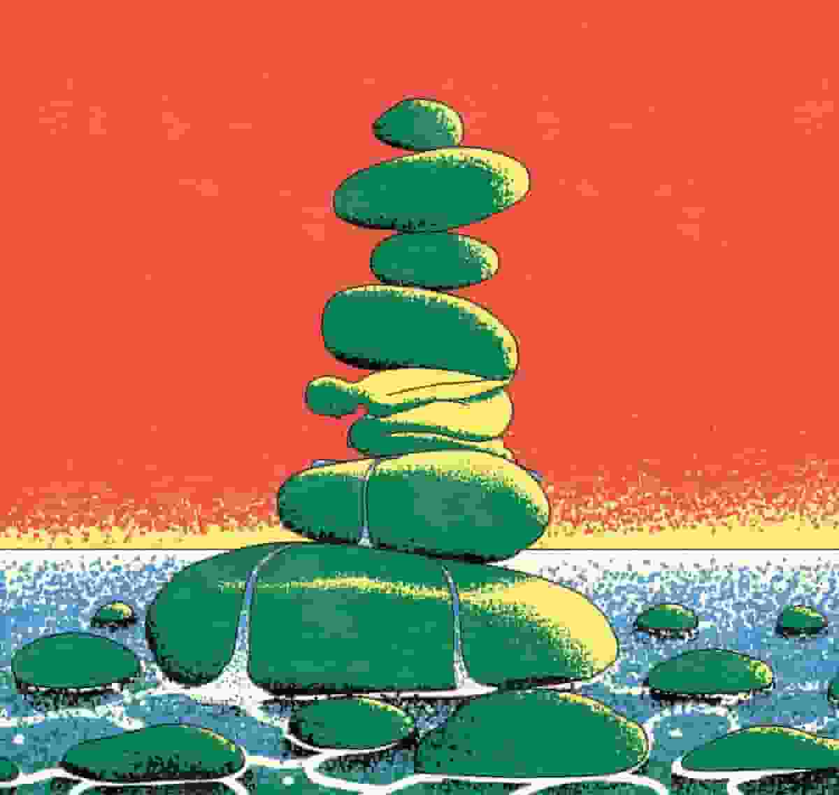
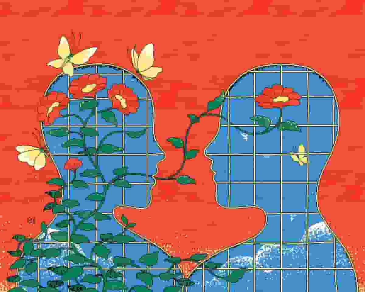
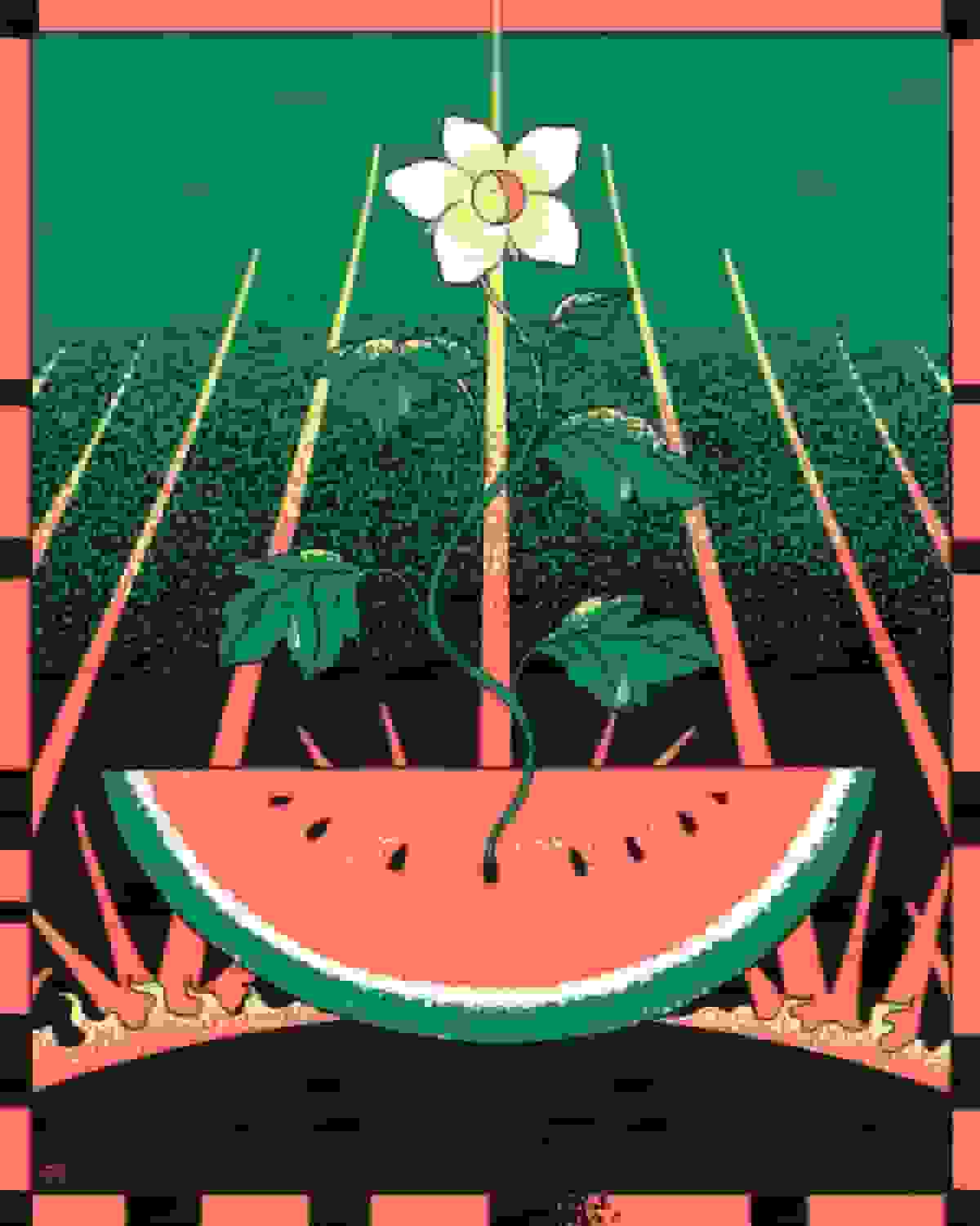
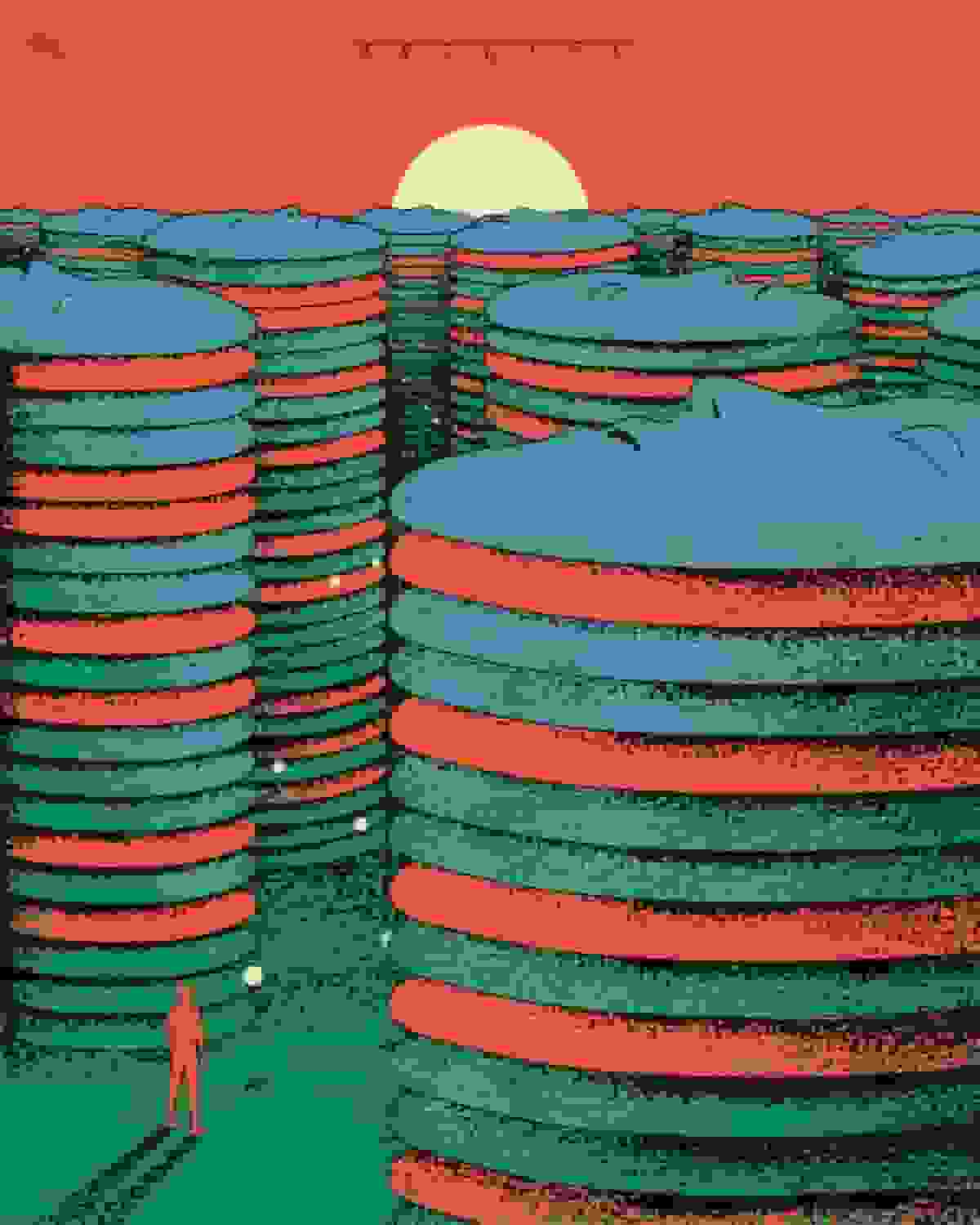
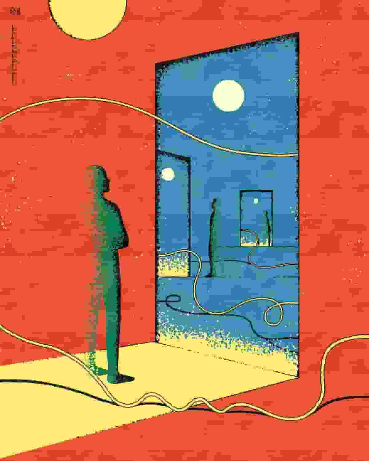
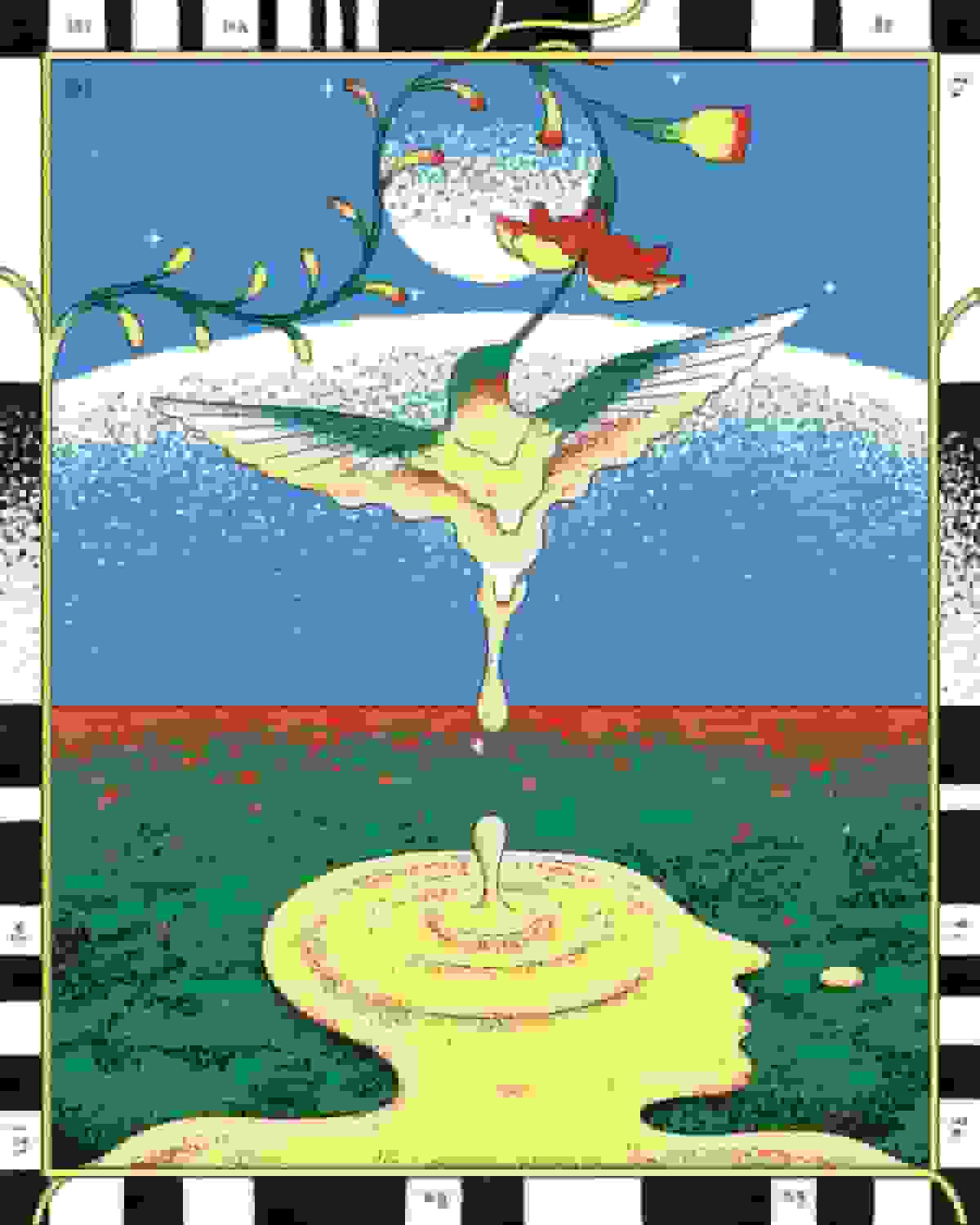
▎Primary Colors and Dappled Textures Give Muhammad Fatchurofi’s Illustrations a Trippy, Nostalgic Feel
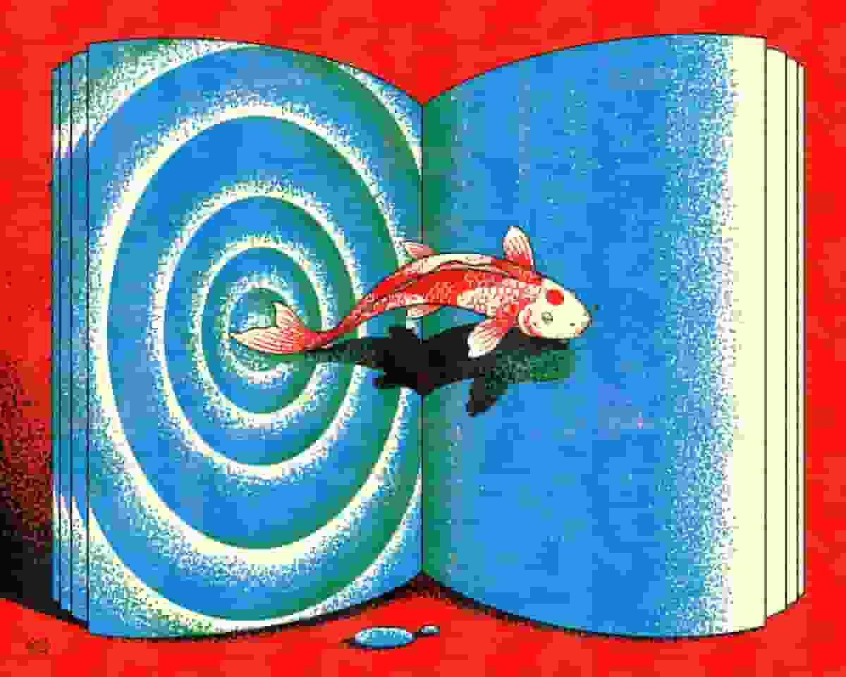
▎Semarang, Indonesia-based artist Muhammad Fatchurofi translates the dappled, grainy textures of the printing press into his vivid illustrations. Whether sketching on paper or digitally, Fatchurofi gravitates toward surreal, mind-bending scenes tinged with nostalgia that he renders in bright, bold shades of primary colors. In one work, a cairn sandwiches a seated green figure between the stones, while another features a red koi fish leaping from a rippling blue page. “For me, these basic colors give a sense of boldness, vibrant, full of energy,” he says.
Fatchurofi works with a long list of editorial and commercial clients, including The New York Times, Google, and Bandcamp, which he balances with personal projects. He likens his practice to journaling, explaining:
I’m interested in using illustration as a mindful way of documenting thoughts, interests, and experiences in my daily life. Within this practice, I try to reflect on my thoughts and experiences in a more positive outlook and to learn something from it. The result is often described by my audience as peaceful and calming.
Fatchurofi is currently working on a series of acrylic paintings he plans to exhibit later this year and adding more limited-edition prints to his shop.
Om onvervangbaar te zijn, moet je altijd anders zijn.
Er zijn fascinerende beelden hier, en de fascinerende dag van samen! xo
─────────────────────────────────────────────────────
Per essere insostituibili bisogna sempre essere diverso.
Ci sono immagini affascinanti qui, e l’affascinante giornata di insieme! xo KanikaChic